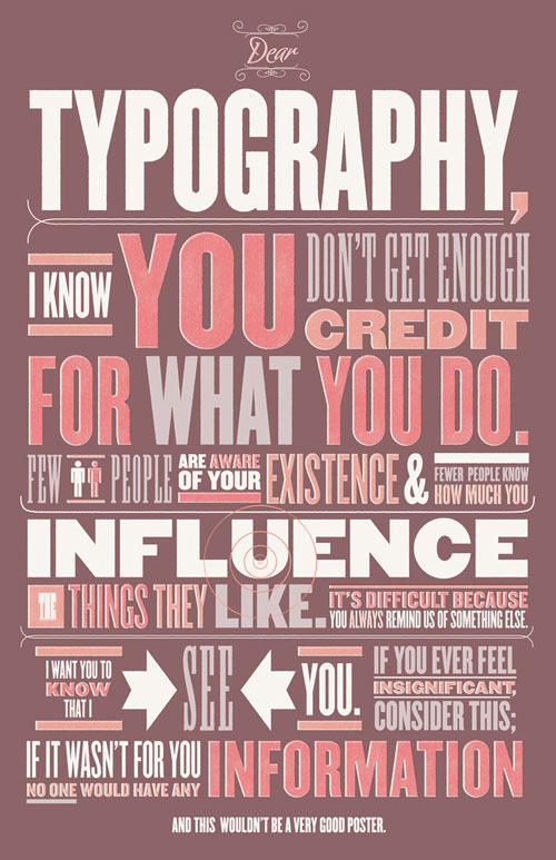
Designing “No Plot? No Problem!”
15229

Based on the book, No Plot? No Problem!: A Low-Stress, High-Velocity Guide to Writing a Novel in 30 Days, this kit takes the tone and task of inspiring writers one step further. It includes a clam shell box, inspiration cards immersed in tongue-in-cheek tone, a Noveling Affidavit, a progress calendar, and other humorous elements to keep a writer on task, all designed in bold colors and a retro-styled typographic treatment that aptly underscores the humor in the kit, and emphasizes the brand tone in the original book. Designed by Rise-and-Shine Studio.

Peek into a Design’s Layers

It can be challenging for designers to communicate to non-designers the amount of work that can go into a good design. This peek into an event poster design is a great opportunity to illustrate part of the design process.

Designer Shelby White, aka Wanken, has generously shared a screen shot, or more aptly, the many screen shots that it took to show the number of layers in the file: 90 layers. File size: 618MB.

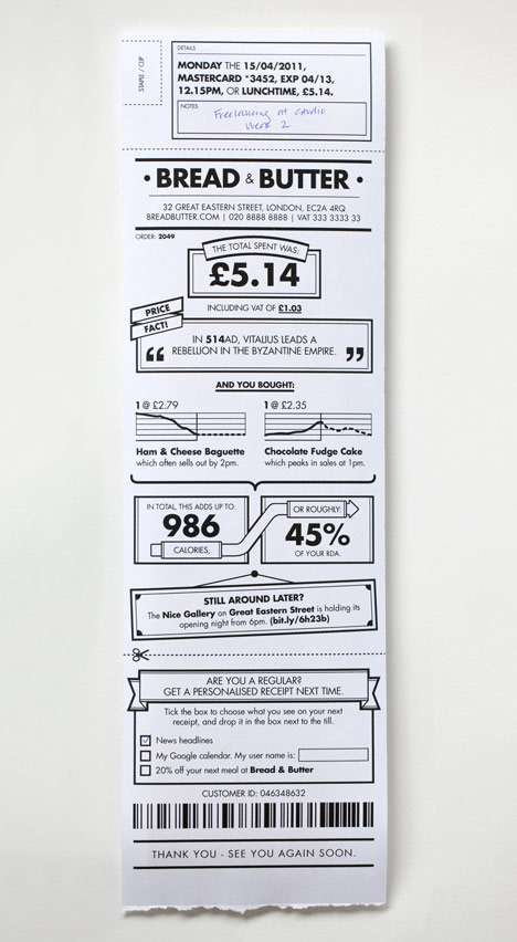
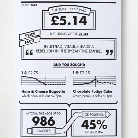
Brilliant Receipt Design doubles as Infographic

Media_httpstaticdezee_smlrt

Here’s a shining example of employing designers’ user-focused and creative problem-solving thinking to transform dull, tired customer touch-points into something of more value. Listing the caloric values of the shopper’s purchases, information about the purchased products’ demand, and even information on events in the area, the simple receipt thus converts the experience of shopping at the market into an activity that directly relates to the customer’s daily routines. It even plays serendipitously with an opportunity in mini history lessons.
Credit: BERG

True Colors Infographic – Breakdown of Color Preferences by Gender

While this test is based on a narrow sampling of 232 people from 22 countries, the main findings are:
• The most preferred color, regardless of gender, is blue
• Orange is associated with inexpensiveness in both genders
• Men prefer brighter hues, but tolerate less saturated colors, and prefer shades over tints
• Women prefer softer hues, are less tolerant of unsaturated colors, and prefer tints over shades
• Purple is widely popular as a favorite among women, but widely unpopular among men

Media_httpblogkissmet_gnufa