


Beautiful identity and packaging design by David Mikush, for Burt&Bumble honey.
Burt & Bumble Packaging & Identity Design

For the Love of Design
Beautiful identity and packaging design by David Mikush, for Burt&Bumble honey.


This packaging design idea for Coke bottles approaches eco-friendliness on several counts. For material, student designer Andrew Kim proposes plant-based material, while the the bottle’s straight-edged shape and curved bottom is tightly stackable, thereby reducing wasted space in shipping containers, and in turn, reducing carbon emissions for the product’s distribution. Additionally, the proposed material is crushable down to 34% the packages’ original size in a pre-scored accordion fold, to encourage habitual recycling. This is a great example of how a few, well-thought out design decisions could impact mass habits, and in turn, encourage desirable effects on the larger scale.

Elegant, streamlined bottles with added letterpress, sticker-peel lables, for Compass Box Whisky Company.

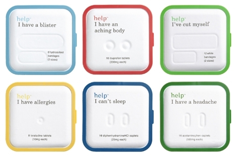
Wonderfully simplified packaging solutions for medication take the mystery out of pharma.

This post from PharmaExecBlog discusses the impact of packaging design on user behavior, and its effects on patients’ habits and health.
Patient adherence is a chronic issue in healthcare, leading to poor disease management, higher hospitalization rates, and lost revenue for Big Pharma. But one often overlooked facet of the complicated chain of events from R&D to marketing to prescribing may hold the key.
Patient adherence is not a new issue in the industry; still, the statistics are jarring. According to a recent white paper released by the Center for Health Transformation (CHT), the estimated annual cost of patients not taking their medications as prescribed is nearly $290 billion, and “approximately 125,000 Americans die annually (342 people every day) due to poor medication adherence.”
Many factors can contribute to patient adherence, or a lack thereof: ease of use, proper patient education, communication between physicians and patients, refill reminders from pharmacies, co-pay costs—the list goes on and on. But there is one element in the chain from Petri dish to patient—the moment a drug is created until the moment it is administered—that may have more of an impact on adherence than is recognized.
Ted Lithgow, PhD, chief science officer of MeadWestvaco (MWV), a provider of pharmaceutical packaging solutions, makes the case that pharmaceutical packaging can play a role in adherence, and in fact is in a unique position to influence patient behaviors. “Packaging is the only element that we know of that touches every single patient,” he says.
But being in a unique position to exact change is not enough to make it happen. Creative designs, strategies, and ideas must be put in place in order to leverage that power. One common example of packaging that can alter behavior is a blister pack with a calendar, where each pill in a 30-day supply is labeled with a day of the week to help patients remember to take their medications regularly. “The number one reason cited in most studies for why patients don’t take their medication is simple forgetfulness,” says Lithgow.
Packages geared toward specific populations are also key, says Lithgow. For example, senior citizens require packages that are easier to open, without difficult press tabs, while still considering the child-safety element. “We know that ease of access and child safety are critical. A package that is difficult to get into or presents challenges for patients, particularly senior patients, will be an adherence problem,” he explains. “In January of this year, the first baby boomer reached 65 years of age. As more of this grey tsunami hits the healthcare system, we’re going to have to be focused on making certain that those patients can use products easily.”
The result of taking all these issues—and more—into consideration is what Lithgow calls “adherence enhancing packaging,” which can affect adherence not only through ease of use, but also by standing out from the crowd. “We know that the majority of products out there are delivered in amber vials,” says Lithgow. “But amber vials don’t do anything to help patients remember when to take their medication, how much they’ve taken, or that it’s time to renew.”
Though at first glance packaging may seem like a tiny cog in a hugely complicated machine, there is a power and a responsibility that the package manufacturer must learn to accept. “There’s a huge cost element in the industry that never existed before that people really have to attend to,” says Lithgow. “In today’s market, it’s really all about cost management.” Cost concerns come from people living longer and staying on medication longer, new patients coming into the system through healthcare initiatives, and more people taking more medications. And Lithgow recognizes that patient adherence is one extremely effective method of cost containment.
“It’s interesting how brand people and marketers spend so much time thinking about how to reach out and touch the patient directly. Direct mail, advertising, and promotional campaigns are more expensive today than ever.” says Lithgow. “And packaging is one tool in the arsenal that brand managers have, and it’s the one tool that happens to touch every single patient. For my money, I think that’s a great investment.”


The simplicity of scarcely-applied black and a brand-emphasizing hit of a single color, together with ample negative space and elegant type, appears to promise a soothing, honest and quality-driven item. Delightful design work by Michael Nagy.


This student design concept incorporates a speedometer design into the nutrition label and places it front-and-center, driving the entire form of the packaging for the energy drink, Ping. While the delicate execution might be too suggestive of a luxury or grooming product, and while more rugged elements could communicate athleticism more clearly, the incorporation of the speedometer element is a clever idea.
Design Credit: Anne Dahlin, Australia


Making the use of concentrated and refillable soap simple and visually clear, the Replenish bottle facilitates smart consumer consumption. Only the bottom portion of the bottle, containing the concentrate, is repurchased, reducing the use of plastic. The concentrate is then inverted into a pre-measured space in the main cavity, where water is poured to dilute the concentrate. Et voilà!


DRY Soda’s lightly sweet beverages, designed to be paired with food, were initially launched in 2005 with a bottle design meant to evoke sophistication. Five years later, the design was updated to represent each flavor more visually, with iconic graphic forms rather than just with type and color. One noted addition: the calorie count, plainly and boldly marked right near the mouth of the bottle.
More via Lovely Package
Design credit: Turnstyle


