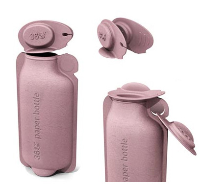
This packaging design idea for Coke bottles approaches eco-friendliness on several counts. For material, student designer Andrew Kim proposes plant-based material, while the the bottle’s straight-edged shape and curved bottom is tightly stackable, thereby reducing wasted space in shipping containers, and in turn, reducing carbon emissions for the product’s distribution. Additionally, the proposed material is crushable down to 34% the packages’ original size in a pre-scored accordion fold, to encourage habitual recycling. This is a great example of how a few, well-thought out design decisions could impact mass habits, and in turn, encourage desirable effects on the larger scale.
Tag: beverages
360—Paper Bottle
Designed by Brand Image, these paper bottles are not only eco-friendly for being made of paper, but are extra green-minded for being made from recycled material.
Humorous Eating & Drinking
By its teapot and dining tray creations, Yanko Design humorously seems to point out that catering to tea for two is as easy as Yin Yang, and that every meal should be treated as a unique DJ mix!
PES Animated Shorts
One of my favorite stop-motion animators, PES, creates great scenes with moody sets highlighted by wonderful lighting and sound, and unusual objects animated with lively kinetics. This set of Bacardi ads is charming.
Energy Drink a-la Speedometer
This student design concept incorporates a speedometer design into the nutrition label and places it front-and-center, driving the entire form of the packaging for the energy drink, Ping. While the delicate execution might be too suggestive of a luxury or grooming product, and while more rugged elements could communicate athleticism more clearly, the incorporation of the speedometer element is a clever idea.
Design Credit: Anne Dahlin, Australia
21 Creative Product Packaging Designs | UnderWorld Magazines
Sophisticated soda dresses bottle with more flavor
DRY Soda’s lightly sweet beverages, designed to be paired with food, were initially launched in 2005 with a bottle design meant to evoke sophistication. Five years later, the design was updated to represent each flavor more visually, with iconic graphic forms rather than just with type and color. One noted addition: the calorie count, plainly and boldly marked right near the mouth of the bottle.
More via Lovely Package
Design credit: Turnstyle